Uniforms Design
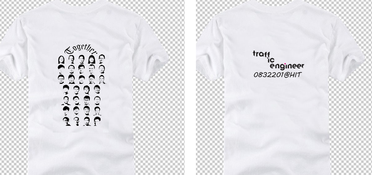
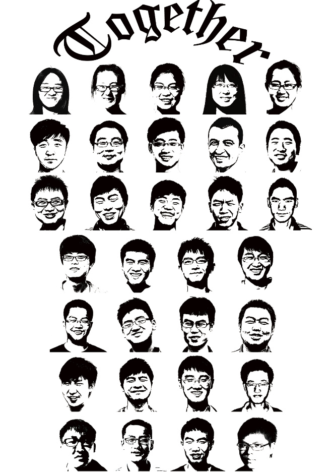
This was desgined during the graduation season. When I looked at the logo of KFC, I though that this kind of style may be useful for our uniforms. So I though about a method which can translate the pictures of all my classmates to monochromatic avatars.

Principles of Design
- Alignment - Edges line up along common rows or columns
- Closure - To perceive a set of individual elements as a single, recognizable pattern
- Constancy - To perceive objects as unchanging
Front

Back

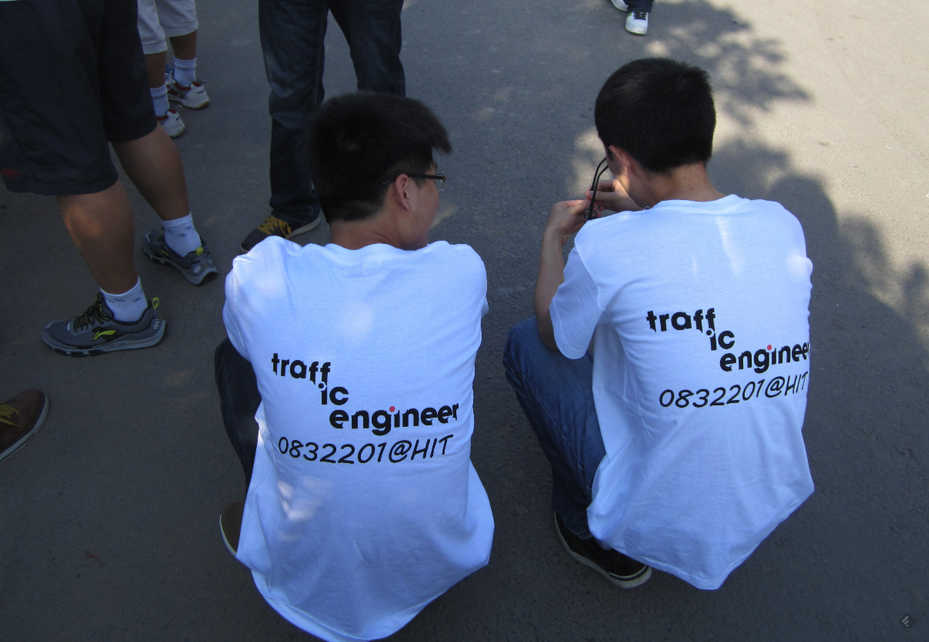
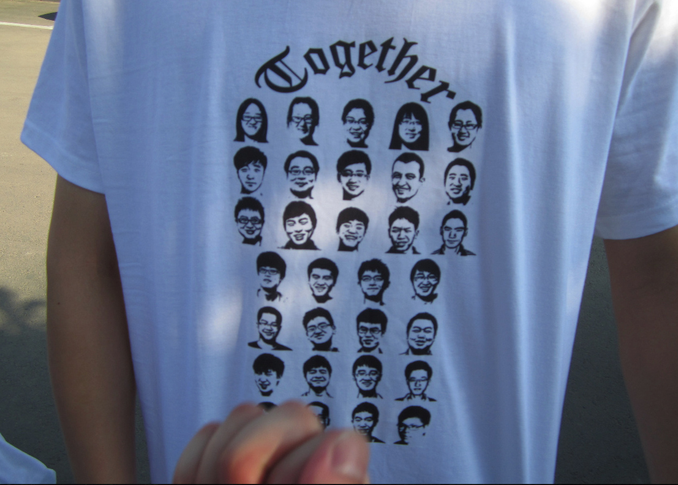
Samples


How it works
You may be curious about the building process of these avatars. All we need to do is just take a picture for your model, and make it into a monochrome style by using Photoshop, Picasa or some other image processing tools.
