Responsive Lists Layout - Three CSS solutions
Recently, I just need to make a lists layout to adapt for PC and mobile devices. Through viewing some design websites, I get three css solutions to make it.
Requirement:
- Every item has to be aligned center and their width and height have to be equal
- The layout can be auto wrapped according to the width of different devices
Three CSS Solutions:
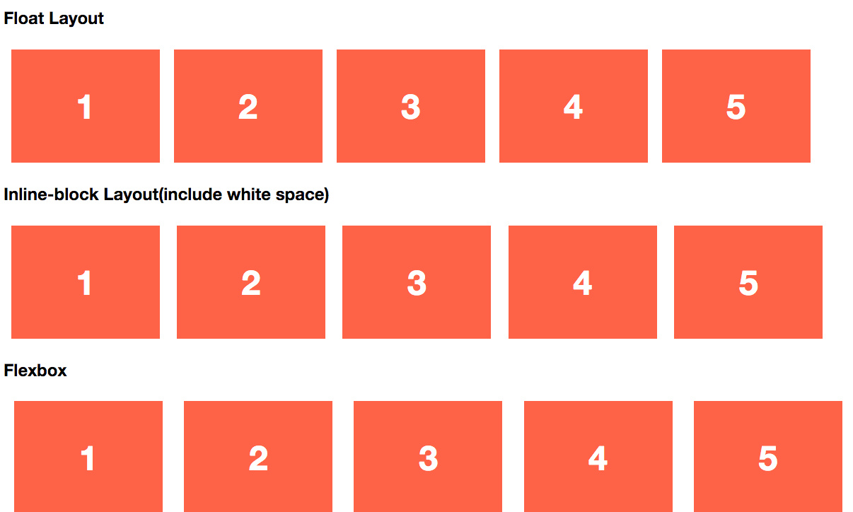
1. Float
It is the most common solution, but many websites avoid to use them because of unstable height of content that might cause text overflow.
But there is a tricky solution that can avoid this issue. We just need to use :after to add an extra blank content without float to make sure the height can be controlled.
Here is the solution.
/*float layout*/
.float {
  max-width: 1200px;
  margin: 0 auto;
}
.float:after {
  content: ".";
  display: block;
  height: 0;
  clear: both;
  visibility: hidden;
}
.float-item {
  float: left;
}
2. Inline-block
Inline-block is simple to add, but one of the shortages is that there will be an backspace between items. Given the extra margin between items, we cannot keep an ideal space between items, even though the extra space is not obvious.
/*inline-block*/
.inline-b {
  max-width:1200px;
  margin:0 auto;
}
.inline-b-item {
  display: inline-block;
}
3. Flexbox
Flexbox is a new feature of CSS3, and it makes the layout of pages more flexible. Given the complexity of this feature, no more descripion about it will be shown here. If you want to know more about it, please view CSS-Tricks.
/*Flexbox*/
.flex {
  padding: 0;
  margin: 0;
  list-style: none;

  display: -webkit-box;
  display: -moz-box;
  display: -ms-flexbox;
  display: -webkit-flex;
  display: flex;

  -webkit-flex-flow: row wrap;
  justify-content: space-around;
}
Here is the demo of three solutions.
See the Pen Responsive List Layout (Flexbox vs Float vs Inline-Block) by Hector Guo (@hectorguo) on CodePen.
Summary
| Description | Compatibility | Reference | |
|---|---|---|---|
| Float | Common use, adapted for lists layout with lots of items. | Any device | dribble |
| Inline-block | adapted for some cases that do not care much about the margin | IE8+ | |
| Flexbox | Different device, different exclusive design. More flexible solution. Emphasis on center alignment. | IE10+(IE10 partial support with prefix: -ms-) |
CSS-tricks |