CSS: Font Setting to Adapt for Multi Platforms

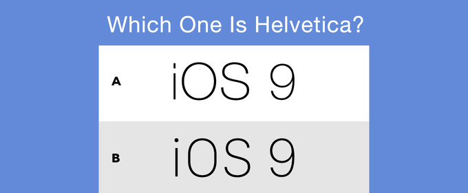
Apple just publish its new systems iOS 9 and OS X EI Capitan recently. With these new systems, a new kind of font are also published, which called San Francisco. It looks like more light and readable than Helvetica, so I decide to use it on my website. However, I realize that the declaration on my style is:
body {
  font-family: "Helvetica Neue",Helvetica,sans-serif;
}
With this style, you can not render this page in new font. I just search for the solution, and find a trick on Webkit site, you can just add -apple-system in front of other font declaration:
body {
  font-family: -apple-system,"Helvetica Neue",Helvetica,sans-serif;
}
With this generic family name, the browser will render web pages with the system default font automaticlly. However, this name just adapt for Apple browser or web view. If you want to use it in Chrome or another browser, it is suggested to do the following:
body {
  font-family: system, -apple-system, ".SFNSDisplay-Regular", "Helvetica Neue", Helvetica,sans-serif;
}
It is said that:
The
.SFNSDisplay-Regularis the private font name for the regular face of San Francisco in the current beta release (remember, it can change at any time!) Thesystemgeneric family name doesn’t currently exist, but I’d encourage browser manufacturers to adopt this technique. It would be helpful for coders on all platforms.
Therefore, I suggest that we can also add some other family name to adapt for Windows and Android. The following is my final style:
body {
  font-family: system,-apple-system,"Helvetica Neue",Helvetica,"Lucida Grande","Open Sans","Microsoft YaHei",sans-serif;
}
"Open Sans" works for Android and "Microsoft YaHei" works for Windows. Even though it isn’t a perfect solution, it works fine in Windows, Android and Apple platform after I use my devices to check if it shows correctly.
BTW, I recommend a tool called Whatfont to help you identify what kind of font it is on a web page.